


Introduction
Types of CSS units
Some commonly used CSS units
Summary
There are varieties of units in CSS, some of which are more commonly used than others. In this article, you will know what relative and absolute units are and understand some of the commonly used units in CSS.
CSS units can be sub-divided into two categories:
Absolute units:
Absolute units are usually based on a physical measurement. Absolute units aren't relative to anything else, Its value is usually fixed. Examples include pixels(px), inches(in), picas(pc), points(pt), Quarter-millimeters(Q), millimeters(mm)
Relative units: Relative units are units that are relative to something else.
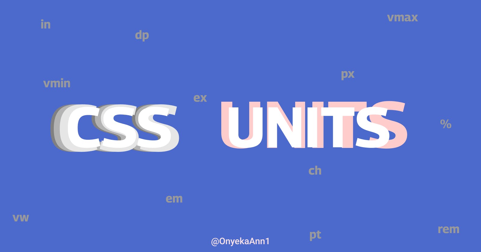
Examples include: percentage(%), rem, em, vh, vw, vmin, vmax, ex, ch
Some commonly used CSS units
rem: rems stands for root ems. This unit is based on the HTML (root) element.
From the above, the html element is set to have a font-size of 20px
p has a font-size of 2rem which is equivalent to 2 * 20 = 40px
You can see the exact font-size of p using the browser inspector. To do this
- Right click on the current page and select inspect
- Click on the 'hello world' text
- Navigate to the computed tab right next to Styles
- You'll see a list of styles applied to the p element search for the font-size property
But what if the Html font size isn't specified?
This will set the font-size relative to the browser's default font size. By default, most browsers have their font-size set to 16px. It is important to note that this can be changed by a user in the browser's settings. If the browser's default font size is set to 16px. 2rem will be 16 * 2 = 32px
Take a look at the font-size of the p element using the browser's inspect tool. What do you see? 32 right. This value might differ if your browser's default font-size isn't set to 16px.
We can override the browser's default font-size by giving the Html element a font size just as seen in the previous example.
em: This sets the font-size of an element relative to its parent's font-size in case of typographical properties like font-size and incases of other properties like width, it sets the length value relative to the font-size of the element itself.
Let us look at some examples below:
From the code above, we have the two p elements nested inside a div each of which have different font sizes. Since we are setting the font-size property, this means that the font-size will be based on the parent's font-size which is the div in our case.For the first-child, 1em = 16 * 1 = 16px
Then for the second-child, 2em = 16 * 2 = 32px
Now let's try something a little bit tricky
The above code is similar to the previous example, we only changed the font size of the div to 2em. Remember that an element's font-size in ems is relative to the font size of its parent.
But what is the font-size of its parent?
Since the parent didn't specify any font size, it goes up the DOM tree until it reaches the root element and then the browser's default font size will be used if no font-size property is specified. Therefore, Our div will be based on the browser's default font size which is 16px(might differ if you changed the font-size in your browser settings).
The font-size of the div = 2em = 2 * 16 = 32px
The font-size of the first-child = 1em = 1 * 32 = 32px
The font-size of the second-child = 2em = 2 * 32 = 64px
Let us look at an example of how it works on non-typographical properties like width
From the above, we can see that the div is set to a font-size of 40px and the width has a value of 4em. This means the width is relative to the font size of the div itself.
The width of the box is 4 * 40 = 160px
percentage(%): percentage is relative to its parent size. For instance, If you set the font-size of an element in percentage, it will be a percentage of its parent font-size and if you set the width of an element, it will be a percentage of its parent width.
From the above, we can see that the child container takes up 90% of its parent's height and 50% of its parent's width.
To see how percentage works with font-size take a look at the code below
As we can see, the li with a class of nested takes up 75% of its parent font-size.
To know the px value,
The parent's font size which is the ul, is set to 20px
Therefore, the li will be 75% of 20px = (75 * 20) / 100= 15px
From the calculation above you can see that 75% is equivalent to 15px. You can check it out using the browser inspect tool.
vh: vh unit is based on the viewport height. 1vh is equivalent to 1% of the viewport height.
The div will always take up 60% of the viewport height.vw: vw unit is based on the viewport width. 1vw is equivalent to 1% of the viewport width.
The div will always take up 50% of the viewport width.
Summary rems - rem is based on the font size of the root element em - When working with typographical properties like font size, the font size of an element is based on the font size of its parent, and in order cases like width, it is based on the font size of the element itself. percentage - percentage is based on the size of its parent vw - vw unit is based on the viewport width vh - vh unit is based on the viewport height
References
MDN